 Skip to content
Guide three: analysing your data
So you’ve set strong business objectives and wrangled with your data to make sure it’s accurate and relevant. Good stuff. Now comes the super important part — the analysis of your data. To do it right, you’ll need to know the different ways you can slice and dice your data. Whichever method you choose, think back to your business use case and what you’re hoping to get from your data.
Descriptive analytics — insight into the past
In many ways the most basic form of analysis, descriptive analytics looks at how your business has performed in the past based on simple variables. For example, how many customers bought a certain type of product. Or which customers bought the least or most number of products. It’s basic stuff, but it can still be powerful.
To get the most from descriptive analytics, you can mix one variable with another to tell a story. For example, if your business use case is to generate 100 leads in Q1, look at two things. Look at the number of leads you generated after your recent Christmas campaign. Then look at how many leads you generated after you launched a new series of banner ads. By comparing the two variables, your data begins to paint a picture of what’s working and what’s not.
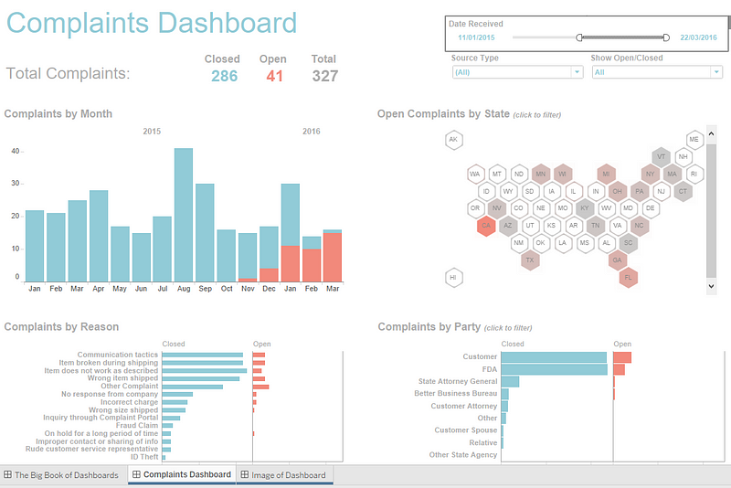
In the example above you can see a dashboard that shows complaints logged in the past. This is broken down by those that have been resolved and those that are still open.
Filters can be applied to narrow down complaints by month, state or party. You can also see a count of the reasons for the complaints, again broken down by resolved and open. Using this dashboard, a user can learn from past behaviours and understand how they might influence future outcomes. What it won’t do however is actually predict future complaints.
Predictive analytics — understanding the future
The buzz word that pops up again and again. Predictive analytics is using past data to predict what will happen in the future. By picking out patterns where history repeats itself, you’re able to forecast events and plan accordingly. You can show recurrence in a number of ways: markers, overlays, time frames, layers, aggregates, etc. This saves you from plotting each individual point and helps people see patterns quicker.
Predictive analytics is often tied up with AI and machine learning because you can feed historical data into a mathematical model that finds patterns and trends in your old data. This same model can then be applied to your current data to automatically predict what will happen next.
Whilst it all seems flashy — predictive analytics is nothing new. Our founder, Hels, started her career at the Met Office, home of predictive analytics in the form of everyday weather forecasts. Back in the day, Hels and the team were using weather data to predict grocery sales at the UK’s top supermarkets. This was way before predictive analytics and AI were buzzwords.
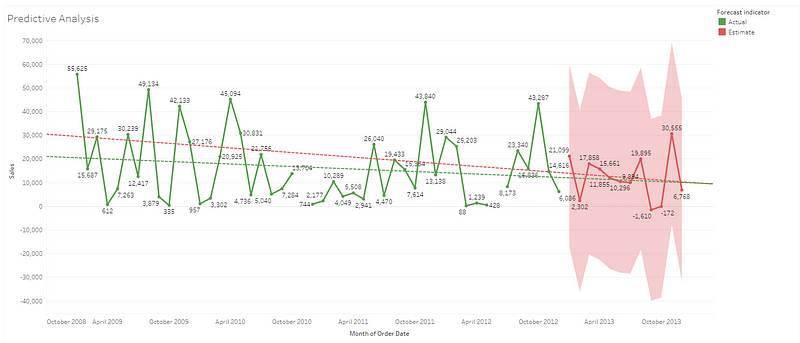
The line chart above shows sales over four years, along with a forecast for future sales into the next year. Using both estimated and actual sales figures, the chart also includes a trend line which predicts future average values.
Prescriptive analytics — advise on possible outcomes
If predictive analytics asks the question, “what’s most likely to happen based on my current data?”, prescriptive analytics asks, “what can I do to change that outcome?”.
Prescriptive analytics is arguably one of the more complicated methods of analysis. Often, it will rely on AI and machine learning to access the impact of multiple future decisions and then provide a scenario for the best outcome. Done well, and prescriptive analytics can be used by analysts to foresee if a change will help them reduce risks, improve operations, and/or increase revenue. In short, it can revolutionise business practice.

In the example above, you can see how many employees in different sectors would fall below the minimum wage if it rose. It also shows in monetary terms how much it would cost each sector if the minimum wage was increased. There is an option to play with the top left filter to see the effect that a rising minimum wage and years of service has on the number of those falling below minimum wage.
Up next, visualising your data
The final stage in your data journey is where you bring your data to life. Our last guide will cover how you can build visualisations that are engaging, interactive and insightful.